
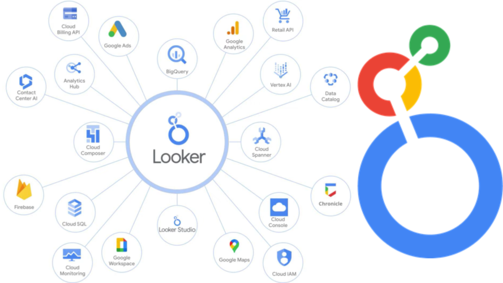

Have you ever looked at a giant spreadsheet full of numbers and felt your brain freeze up? Numbers are super important for growing a website or business, but staring at rows and rows of data is no fun at all. That is where a magical tool called Google Looker Studio comes in to save the day. It takes all those boring numbers and turns them into bright, colorful pictures, charts, and graphs.
Think of it like building with digital LEGO blocks for your statistics. Instead of guessing how your website is doing, you can see the truth in seconds. Whether you run a big online store or a small blog, tracking your progress should be easy. When you use Google Looker Studio, you stop wasting hours trying to make sense of messy data. You get a clear picture of what works and what needs fixing right away. It is like having a superpower for your daily work routine.
How to Get Started With Your First Dashboard
Starting something new can feel a little scary, but setting up your very first project is actually a breeze. First, you need a Google account, which you probably already have. Head over to the website and log in to open your workspace. You will see a big button that lets you start a blank report or pick a cool template.
If you are a beginner, picking a template is the smartest choice. It gives you a head start by showing you where charts and numbers usually go. Next, you need to connect your data source. This could be Google Analytics, a Google Sheet, or even an ad account. Just click a few buttons to link them together safely. Once your data flows in, you can drag and drop different visual elements onto your screen. You do not need to know any fancy computer coding to make it look amazing. Within just a few minutes, your raw numbers transform into a living, breathing report.
Connecting Your Favorite Data Sources Easily
A report is only as good as the numbers you put inside it. If your information is trapped in different apps, you will spend all day jumping back and forth. Thankfully, Google Looker Studio lets you connect all your favorite tools in one central place. You can pull information straight from Google Ads, YouTube, Facebook, and Excel files.
Imagine having your website traffic, social media likes, and sales numbers all sitting on the exact same screen. That means no more copy-pasting numbers into boring offline files every single morning. When you connect your data sources properly, your dashboards update themselves automatically. If a customer buys something or a new visitor reads your blog, the change shows up instantly. This saves you tons of time and keeps your team on the same page. You can focus more on making smart business choices and less on manual data entry chores.
Designing Reports That People Actually Love to Read
Nobody likes staring at a messy, ugly report with tiny text and confusing colors. If your dashboards look boring, people will simply close them and ignore your hard work. To fix this, you should focus on clean layouts, bright accent colors, and lots of empty space. Google Looker Studio gives you total freedom to change fonts, add logos, and style your pages.
Try to keep your most important numbers right at the top where eyes look first. Use big, bold numbers for totals so viewers can understand the main point instantly. Adding simple bar charts or line graphs helps break up heavy walls of text. You can even use brand colors that match your company logo to make everything look professional. When your reports look neat and friendly, your clients or team members will actually enjoy reading them. Good design turns confusing statistics into a fun story that everyone can easily understand.
Using Filters to Find the Exact Information You Need
Sometimes you have way too much information on your screen at once. Looking at total numbers from the whole world is nice, but what if you only want local data? That is where interactive filters come in to save your sanity. Google Looker Studio lets you add drop-down menus and date pickers right onto your reports.
With just one click, a reader can filter the entire dashboard to show only last week’s traffic. Or they can look at visitors coming from a specific country, like the United States or Pakistan. This makes your reports super powerful because one single page can answer dozens of different questions. You do not have to build ten separate reports for ten different people. Instead, you build one smart report and let your users filter what they need. It keeps your workspace clean, organized, and deeply helpful for everyone involved in your projects.
Tracking Website Traffic Like a True Professional
If you own a website, you probably want to know how many people visit every single day. Tracking your traffic helps you figure out which articles or products are popular. You can use Google Looker Studio to build a dedicated website traffic hub. It shows you total visitors, page views, and how long people stay on your pages.
When you watch these trends over time, patterns start to appear naturally. You might notice that your blog posts get more readers on weekends than on weekdays. Armed with that knowledge, you can plan your publishing schedule around your audience’s habits. You can also see which search terms bring people to your site from Google search results. This helps you write more of the content your readers truly love. Tracking traffic stops being a guessing game and turns into a fun daily routine.
Sharing Your Dashboards With Clients and Teams Safely
Once you build an awesome report, you will want to share it with the world. Sharing your hard work makes collaboration easy and keeps everyone updated on your goals. Google Looker Studio makes sharing as simple as sending a normal link to a friend. You can give people permission to view your reports or even edit them together.
You can email a PDF copy of your dashboard every Monday morning automatically. Or you can embed the live interactive report directly inside a private team website. The best part is that you stay in full control of your private business numbers. If a client stops working with you, you can turn off their access with a single click. This keeps your data secure while still letting you show off your amazing marketing results. Working together as a team becomes smooth, fast, and completely stress-free.
Fixing Common Mistakes When Building Reports
Even smart people make mistakes when they build their very first digital dashboards. One common mistake is putting way too many charts on a single page. If your screen is crowded, readers will get overwhelmed and miss the main message. Always try to keep your layouts simple and give each chart enough breathing room.
Another mistake is forgetting to check if your data sources are connected right. Sometimes an old link breaks, and your charts will show blank spaces or error codes. You should always double-check your connections before sending a report to a boss or client. Also, make sure your date ranges match up across all your different visual blocks. If one chart shows last month while another shows last year, your conclusions will be wrong. Learning from these tiny hiccups will make you a master dashboard builder in no time.
Advanced Tricks to Make Your Reports Stand Out
Once you master the basics, you might want to try some cool advanced tricks. Did you know you can create your own custom calculated fields inside your reports? This means you can do math on your data right inside the tool without spreadsheets. For example, you can calculate conversion rates or profit margins automatically on the fly.
You can also add interactive control buttons that let users change chart types with a click. Some creators even use conditional formatting to turn numbers red if they drop too low. This acts like an alarm system that alerts you to problems immediately. Adding these clever features takes your reports from basic to mind-blowing. Your clients will be super impressed by how modern and responsive your dashboards feel. Experimenting with new features is the best way to keep improving your daily workflow.
Supercharging Your Digital Agency Workflow
Running a digital marketing or guest posting agency keeps you busy from morning to night. You have to manage client campaigns, track SEO rankings, and write reports constantly. Building custom performance trackers for every single client used to take hours of painful manual labor. Now, smart agencies use automated systems to handle the heavy lifting.
By setting up master templates, you can launch a new client report in less than five minutes. You just swap out the data source link, and all the charts update instantly. This leaves you with more time to focus on growing businesses and writing great content. Clients love seeing transparent, live data whenever they want to check their progress. It builds massive trust and keeps long-term business relationships strong and happy. Automating your reporting routine is the ultimate secret to scaling any modern online agency.
Frequently Asked Questions
Is Google Looker Studio completely free to use?
Yes, it is totally free for anyone with a standard Google account. You do not have to pay any monthly subscription fees to build and share unlimited reports.
Do I need to know how to code to use it?
Not at all! The platform uses a simple drag-and-drop builder, meaning anyone can create gorgeous charts without writing a single line of computer code.
Can I connect Excel files to my reports?
Yes, you can easily upload CSV or Excel files from your computer or link them directly through Google Drive to use as a data source.
How often do the dashboard numbers update?
The numbers update based on your data source settings. Many online tools update in real time or refresh automatically every few hours.
Can I share my reports with people outside my company?
Yes, you can share view-only links with clients, friends, or the public just like you share a Google Doc file.
Is it hard to learn for absolute beginners?
It is very beginner-friendly. If you know how to use basic spreadsheets, you will feel right at home within your first ten minutes of exploring.
Conclusion
Turning messy data into clear, beautiful pictures does not have to feel like rocket science. With the right tools and a little bit of practice, anyone can build amazing performance reports. We explored how easy it is to set up your workspace, connect data sources, and share your work safely. Now it is your turn to jump in and create your very first dashboard today. Open up your browser, link your favorite data source, and watch your numbers come alive. What kind of report are you going to build first? Let us know your thoughts and take action right now!